NTCG Clapham Community Outreach

NTCG Clapham Community Outreach

NTCG CLAPHAM COMMUNITY OUTREACH

Supporting Community Outreach Through Clear, Practical Communications
NTCG CLAPHAM COMMUNITY OUTREACH

case study

NTCG Clapham needed practical communications to support its outreach work within the Stockwell community.

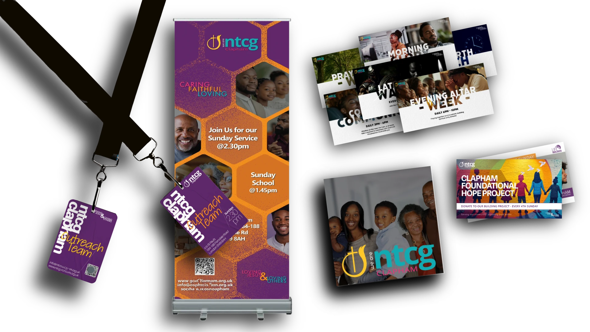
We developed a coordinated set of materials, including a pull-up banner, outreach worker ID cards, flyers and screen visuals. Each was designed for a different purpose while maintaining a consistent identity, helping the team present itself clearly and professionally during community activities.

CLIENT
NTCG CLAPHAM

SECTORS
Charities, Non-Profits & Community • Faith & Churches

SERVICES
Branding • Print & Publishing • Conferences & Events • Digital Marketing

PROJECT
Community Outreach Communications

Brief

Create a set of clear, practical communications to support NTCG Clapham’s outreach work within the Stockwell community. The materials needed to help establish a visible presence on the estate, clearly identify outreach workers and support ongoing engagement with local residents across print and digital touchpoints.

THE CHALLENGE

Community outreach relies heavily on face-to-face interaction. That means communications have to do more than simply look good.

When the NTCG Clapham outreach team is active within the Stockwell community, residents need to be able to recognise who they are, understand who they represent and engage with them confidently.

The team therefore needed a collection of practical materials that could support different aspects of its outreach activity while maintaining a consistent and recognisable identity.

THE APPROACH

Communications Designed for the Environment

Rather than treating each requirement as an isolated design job, we approached the materials as different parts of the same community-facing presence.

The focus was on creating communications that were clear, recognisable and practical for the environments in which the outreach team operates.

PULL-UP BANNER

A portable pull-up banner gives the outreach team a clear visual presence when working within the community.

It provides an identifiable focal point for the team and helps residents understand who is behind the outreach activity.

OUTREACH WORKER ID CARDS

Identification is particularly important when representatives of an organisation are working directly within a residential community.

ID cards were created for outreach workers to provide clear identification while they are active on the estate, supporting a professional and recognisable presence.

FLYERS

Flyers provide the team with flexible printed communications for particular activities, messages and opportunities to engage.

They can be produced as needed while remaining visually connected to the wider communications used by the outreach team.

SCREEN VISUALS

Digital screen visuals extend the same communication approach into other environments, helping announcements and outreach-related information remain clear and visually consistent.

CREATIVE SCOPE

  • Community Communications
  • Pull-Up Banner Design
  • Outreach Worker ID Cards
  • Flyer Design
  • Screen Visuals
  • Print + Digital Artwork

DESIGNED FOR OUTREACH IN THE COMMUNITY

The materials were designed around how the outreach team works within the Stockwell community. The pull-up banner creates a visible presence, while ID cards help residents clearly identify outreach workers and who they represent.

Flyers and screen visuals provide flexible ways to support ongoing activities and communication.

ntcg-clapham-community-outreach-communications

CONSISTENT ACROSS DIFFERENT TOUCHPOINTS

Each piece serves a different purpose while maintaining a consistent connection to NTCG Clapham.

This creates a more recognisable presence across the banner, ID cards, flyers and screen visuals, while allowing new materials to be added as the outreach develops.

THE OUTCOME

A Consistent Presence in the Community

The result is a growing set of communications that supports NTCG Clapham's outreach work across physical, printed and digital settings.

From identifying outreach workers to establishing a visible presence on the estate, each piece has a specific practical role while contributing to a consistent overall identity.

It is a good example of how communications do not always need to be large campaigns to make a difference. Sometimes the most valuable work is making sure the people delivering a programme have the right tools to communicate clearly where the work is actually happening.

COMMUNICATIONS THAT SUPPORT THE WORK

CONNECTED SERVICES

For charities, churches and community organisations, effective communications need to work in the real environments where people interact with your organisation.

We help create joined-up digital, print and physical communications that support your teams, programmes and the communities you serve.

ntcg-west-croydon-website-showcase-v2

PRINT + PUBLISHING

Creating practical, professional print materials that communicate clearly and work effectively in real-world settings.

1920x1440 ELEVATE SOCIALS

DIGITAL MARKETING

Creating digital visuals and campaign content that keep communications clear, consistent and engaging across digital channels.

APS Provides

APS Provides

APS PROVIDES

Connecting Accessible Transport, Mobility and Tourism Through One Digital Presence

APS Provides

case study

APS Provides is a Jamaica-based accessibility services business supporting people through accessible transport, mobility aids and accessible tourism. Synergise Media helped bring these connected services together within a clearer digital presence, supported by consistent brand applications across digital and printed communications.

CLIENT
APS Provides

SECTOR
Transport & Accessibility

SERVICES
Web Design · Digital Marketing · Print & Publishing

PROJECT
Multi-Service Website & Communications

Brief

APS Provides operates across three related but distinct service areas: accessible transport, mobility aids and accessible tourism. The business needed a digital presence capable of explaining each service clearly while presenting them as part of one connected accessibility proposition.

The project also needed to support the organisation beyond the website, creating greater consistency across social media and printed communications used with customers, partners and other stakeholders.

THE CHALLENGE

Accessibility sits at the heart of the APS proposition, but the organisation serves audiences with different needs and different reasons for making contact.

Someone arranging wheelchair-accessible transport requires a different journey from someone researching mobility equipment or planning accessible tourism in Jamaica. Those services needed to be easy to distinguish without fragmenting the organisation into separate brands.

The challenge was to create a clear structure around those different journeys while maintaining one recognisable and professional APS presence.

THE APPROACH

We structured the digital experience around the three core APS service areas: Accessible Transport, Mobility Aids and Accessible Tourism.

Each service was given a clearer pathway within the wider website, allowing visitors to identify the support relevant to them while retaining access to the broader APS proposition.

The visual system was then applied consistently across the website, social content and printed materials. This created a more coherent communications environment while allowing individual materials to adapt to their specific audience and purpose.

Rather than treating web, social and print as separate projects, the work focused on making each touchpoint feel like part of the same organisation.

CREATIVE SCOPE

• Website planning and information architecture
• Accessible Transport service pathway
• Mobility Aids service pathway
• Accessible Tourism service pathway
• Responsive WordPress design and development
• Accessibility-informed interface design
• Brand guidelines and visual consistency
• Social media creative templates
• Business cards and printed collateral
• Letterheaded communications
• Partner and stakeholder materials

THREE SERVICES, ONE DIGITAL HOME

The website provides a common home for APS while giving each core service enough space to communicate its own purpose.

Visitors looking for accessible transport can move towards transport information and enquiries, while mobility and tourism audiences can follow pathways relevant to their needs. Consistent navigation and visual treatment keep those journeys connected to the wider APS organisation.

This structure also gives APS room to develop individual service areas over time without losing the relationship between them.

EXTENDING THE EXPERIENCE BEYOND THE WEBSITE

The same visual language was carried into supporting digital and printed communications so that APS could present itself more consistently wherever customers and partners encountered the organisation.

Social media templates created a recognisable framework for ongoing communication, while business stationery and printed materials extended that consistency into physical interactions.

The result was a connected set of communications rather than a website operating in isolation.

THE OUTCOME

APS gained a clearer platform for communicating three connected accessibility services through one organisation.

The website provides more distinct routes into Accessible Transport, Mobility Aids and Accessible Tourism, while the supporting digital and print materials give APS a more consistent presence across customer and stakeholder communications.

Most importantly, the project created a foundation that can accommodate the continued development of APS and its individual services without each new communication having to start from scratch.

“

“From concept to handover, Synergise Media offered exceptional creativity and support. The team went above and beyond to ensure that APS Provides' every need was met.”

Donovan | Founder & CEO

MAKE COMPLEX SERVICES EASIER TO UNDERSTAND

CONNECTED SERVICES

When an organisation provides several connected services, its website and communications need to help people quickly understand what is available and where to go next. We help bring those different touchpoints together into one clearer experience.

WEB DESIGN

Structuring multiple services into clear digital journeys within one connected website.

DIGITAL MARKETING

Creating consistent digital assets to support ongoing communication and visibility.

PRINT & PUBLISHING

Carrying the APS identity into professional printed and stakeholder communications.

Synergise Estates

Synergise Estates

Synergise Estates

Premium Branding and Web Launch

Synergise Estates

case study

Synergise Estates was created to connect property opportunities with investors looking for clear, credible and professionally presented opportunities. As a new business entering a competitive market, it needed a brand and digital presence that could establish trust from the outset.

Synergise Media developed the brand identity and website together, creating a consistent foundation for how the business presents itself, communicates with investors and supports future growth.

CLIENT
Synergise Estates

SECTOR
Service Businesses

SERVICES
Branding · Web Design · Digital Strategy

PROJECT
Brand Identity & Website Launch

The Brief

Synergise Estates was launching into the competitive London market and required a trustworthy, high-end digital ecosystem that immediately signaled professionalism and stability. The challenge was integrating the new brand with a platform capable of attracting premium clients and handling efficient property listing management.

the challenge

As a new entrant into the property sector, Synergise Estates did not have an established reputation or existing visual identity to rely on. The brand therefore needed to communicate credibility quickly while remaining approachable to prospective investors.

The challenge was to create an identity and digital presence that felt professional without becoming overly corporate, while giving the business a clear foundation that could grow alongside its property services, investor communications and future opportunities.

THE APPROACH

We approached the brand and website as one connected system rather than two separate pieces of work.

The visual identity was developed around a clean, modern and approachable property aesthetic, using a distinctive colour palette and recognisable brand mark to create consistency across digital and physical applications.

The website then translated that identity into a professional investor-focused experience, with clear navigation, structured service information, lead capture and space for property opportunities, resources and future content.
This reflects the documented site scope, including investor resources/downloads, compliance pages, SEO/blog capability and lead capture.

CREATIVE SCOPE

  • Brand identity development
  • Logo design
  • Colour palette and typography
  • Brand application
  • Website design
  • WordPress development
  • Investor-focused content structure
  • Lead capture
  • Investor resources and downloads
  • Compliance page integration
  • SEO-ready content structure

FROM NEW BUSINESS TO RECOGNISABLE BRAND

The identity needed to give Synergise Estates a professional presence from its first interaction while remaining flexible enough to grow with the business.

The visual system combines a distinctive property-led mark with a confident blue and green palette, clean typography and consistent application across the brand. Together, these elements create an identity that feels established, approachable and recognisable without relying on the conventions of a traditional estate agency.

THE DIGITAL EXPERIENCE

The website extends the identity into a practical digital platform designed around the needs of a property and investor-focused business.

Rather than functioning only as an online brochure, the site provides a foundation for presenting services, capturing enquiries, sharing investor resources and publishing future property and insight content. Supporting compliance information was also incorporated into the structure, helping the business present a more complete and credible digital presence.

The Impact

The unified approach resulted in a powerful market entry tool. Client confirmation: "Working with Synergise Media transformed how our brand communicates trust and professionalism. The new site reflects our compliance standards, investor focus, and the quality of service we deliver daily. It’s not just a website - it’s a foundation for how we build long-term investor relationships."

“

Working with Synergise Media transformed how our brand communicates trust and professionalism. The new site reflects our compliance standards, investor focus, and the quality of service we deliver daily. It’s not just a website - it’s a foundation for how we build long-term investor relationships.

Synergise Estates Team

BRING THE DIFFERENT PARTS OF YOUR BRAND TOGETHER

CONNECTED SERVICES

When your organisation offers more than one service, the challenge is making everything feel connected. We help turn that complexity into a clear brand, message and digital experience.

WEB DESIGN

Extending your identity into brochures, reports, publications and other physical communications.

Branding

Building a visual identity around a clear strategic foundation.

APS digital marketing examples

DIGITAL MARKETING

Digital communications that help organisations stay visible, relevant and connected with their audiences.

NTCG West Croydon

NTCG West Croydon

NTCG WEST CROYDON

Bringing Church Communications Together Across Web, Social and Print

NTCG West Croydon

case study

NTCG West Croydon is an active church community with ministries, services, events and outreach activity serving different audiences throughout the year. Synergise Media helped bring those communications into a more cohesive digital and visual environment, creating a clearer website alongside consistent supporting content for ongoing church activity.

CLIENT
NTCG West Croydon

SECTOR
Faith & Churches

SERVICES
Web Design · Digital Marketing · Print & Publishing

PROJECT
Church Website & Communications

Brief

NTCG West Croydon needed a more effective way to communicate the breadth of church life online. Information about services, ministries, events and community activity needed to be easier to find, while the website had to provide a welcoming introduction for people encountering the church for the first time.

The requirement extended beyond the website. Regular events and church initiatives also created an ongoing need for digital and printed communications that could remain recognisably connected to NTCG West Croydon.

THE CHALLENGE

Church communications serve several audiences simultaneously. Existing members need quick access to practical information, ministries need space to communicate their activity, event campaigns need visibility, and first-time visitors need to understand who the church is, what happens there and how they can connect.

The challenge was to organise that range of information without creating a website that felt crowded or difficult to navigate, while also establishing enough visual consistency for communications produced throughout the year.

THE APPROACH

We approached the website as the central communications hub for the church, organising content around the information people were most likely to need and the different ways they might engage with NTCG West Croydon.

Church information, ministries, events and other key content were given clearer pathways within the site, creating a more structured experience for regular members and new visitors.

That digital foundation was supported by a consistent approach to social and print creative. Rather than every event or initiative appearing disconnected, individual campaigns could retain their own character while still sitting within the wider visual presence of the church.

CREATIVE SCOPE

• Website planning and information architecture
• Responsive WordPress design and development
• Church and visitor information
• Ministry content and pathways
• Events and programme communications
• Social media campaign creative
• Event flyers and promotional graphics
• Printed promotional materials
• Ongoing digital content support
• Visual consistency across communications

A DIGITAL HOME FOR CHURCH LIFE

The website was structured to provide more than general information about the church. It needed to act as a practical starting point for people looking for services, ministries, events and ways to connect.

Clearer information pathways help different audiences reach relevant content without requiring every visitor to follow the same journey. At the same time, the visual treatment creates a welcoming and consistent experience across the wider site.

COMMUNICATIONS THAT CAN CHANGE WITHOUT FEELING DISCONNECTED

Church activity changes constantly throughout the year, so the wider communications system needed enough flexibility to accommodate different events, ministries and campaigns.

Social graphics, event promotions and printed materials could therefore take on different creative treatments while retaining a recognisable relationship with NTCG West Croydon.

This gave individual initiatives room to communicate with their own audiences without every new campaign feeling as though it came from a different organisation.

THE OUTCOME

NTCG West Croydon gained a clearer central platform for communicating church life alongside a more consistent approach to supporting digital and printed content.

The website gives members, visitors and the wider community clearer routes into information about the church, while the supporting creative provides a flexible framework for communicating events and initiatives throughout the year.

Together, these elements provide a stronger foundation for ongoing communication without requiring every activity to look identical.

“

“The NTCG West Croydon website has a number of excellent features. Primarily, it is easy to navigate with very intuitive functionality. The website promotes a professional and corporate feel to the organisation, whilst at the same time providing a subtle and personal touch. Great job!”

Anthony | Pastor's Council

BRING YOUR COMMUNICATIONS INTO ONE CLEARER SYSTEM

CONNECTED SERVICES

Churches communicate with members, visitors and communities across many different channels. We help bring those touchpoints together so information is easier to find and each communication still feels connected to the organisation behind it.

WEB DESIGN

Creating a central digital home for church information, ministries, events and community engagement.

DIGITAL MARKETING

Supporting events and initiatives with flexible, recognisable digital campaign creative.

PRINT & PUBLISHING

Extending church and event communications into professionally designed physical materials.

Alex Higgins Academy

Alex Higgins Academy

ALEX HIGGINS ACADEMY

Making Mentoring, Counselling and Psychoeducation Easier to Understand Online

Alex Higgins Academy

case study

Alex Higgins Academy provides mentoring, counselling and psychoeducation, bringing several forms of personal and educational support together within one organisation.

CLIENT
Alex Higgins Academy

SECTOR
Coaching & Training

SERVICES
Web Design · Digital Strategy

PROJECT
Website Redesign & Information Architecture

Brief

Alex Higgins Academy's existing website needed to represent an organisation offering several connected but distinct forms of support.

Mentoring, counselling and psychoeducation each needed enough space to be understood individually, while still feeling part of one coherent Academy.

The brief was therefore to create a website that could organise the Academy's services more clearly, strengthen its digital credibility and give prospective clients a more confident route into the organisation.

THE CHALLENGE

When an organisation provides several forms of support, simply listing services is not enough. Visitors need to understand the differences between them and recognise which route may be relevant to their circumstances.

The Academy also works in areas where trust, credibility and human connection matter. The website therefore needed to communicate the professionalism of the organisation without losing sight of the people delivering the support.

The challenge was to bring those requirements together within a digital structure that remained straightforward to navigate.

THE APPROACH

We began by treating the website as an information and communication problem before a visual design problem.

The Academy's core services were separated into clearer pathways, allowing Mentoring, Counselling and Psychoeducation to be explored individually while remaining visibly connected within the wider organisation.

A dedicated Meet the Team section brought the people behind the Academy forward, while clearer content organisation and navigation helped visitors move from understanding the organisation to exploring the support available.

The visual design was then developed around that structure, creating a professional and confident digital environment without making the experience feel overly corporate or impersonal.

CREATIVE SCOPE

  • Website strategy and information architecture
  • Responsive Website design and development
  • Mentoring service pathway
  • Counselling service pathway
  • Psychoeducation service pathway
  • Meet the Team profiles
  • Content structure and navigation
  • Trust and credibility content
  • Mobile-responsive layouts
  • Contact and enquiry pathways
  • Ongoing content framework

MAKING MULTIPLE SERVICES FEEL LIKE ONE ACADEMY

The website needed to explain three core areas of support without presenting them as disconnected services.

Clear information pathways allow visitors to explore Mentoring, Counselling and Psychoeducation according to what they need, while consistent navigation, visual language and page structure reinforce that each service belongs to the same organisation.

This created a clearer relationship between the individual services and the wider purpose of Alex Higgins Academy.

PUTTING PEOPLE BEHIND THE SERVICES

For an organisation centred on mentoring, counselling and education, understanding who is providing the support is an important part of building confidence.

The Meet the Team area gives individual practitioners a visible place within the website rather than presenting the Academy as a faceless organisation.

Profiles help visitors understand the people behind the services and contribute to a more personal introduction to the organisation before an enquiry is made.

“

“I cannot praise the work done by Synergise Media enough. From the initial consultation, they were able to grasp our vision for the website and the values and ethos of our organisation.Throughout the whole process Synergise Media showed diligence and attention to detail to every page, every image and all content. Synergise Media had a great way of facilitating choice, autonomy, creative freedom and direction."

Stefan | Founder

THE OUTCOME

The redesigned website gave Alex Higgins Academy a clearer digital structure for presenting its multidisciplinary services and the people delivering them.

Visitors can move from understanding the Academy to exploring Mentoring, Counselling or Psychoeducation through more clearly defined pathways, while the wider visual and information structure maintains a consistent organisational identity.

The result is a website better equipped to communicate the Academy's purpose, support future content and provide a clearer route from initial interest to informed enquiry.

TURN COMPLEX SUPPORT INTO A CLEARER DIGITAL EXPERIENCE

CONNECTED SERVICES

When your organisation provides different forms of support, people need to quickly understand what you offer, who it is for and where they should go next. We help organise complex information into digital experiences that feel clear, credible and human.

WEB DESIGN

Structuring services and information around the questions and journeys of the people using the website.

Branding

Creating a consistent visual presence that helps different services feel part of one organisation.

DIGITAL STRATEGY

Organising content, pathways and calls to action so the website supports clearer communication and enquiry.