NTCG National Sports Day 2026

NTCG National Sports Day 2026

NTCG NATIONAL SPORTS DAY 2026

Building a Campaign Around a National Community Sports Event
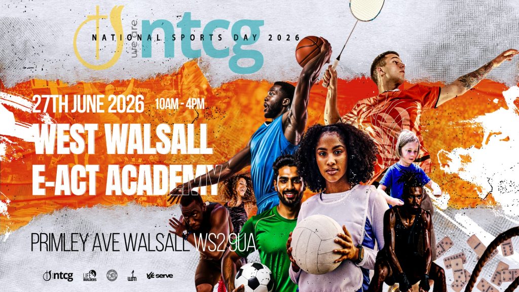
NTCG National Sports Day

case study

Synergise Media developed and delivered the visual campaign for NTCG National Sports Day 2026, organised by National Lifebuilders, Women’s Discipleship Ministries & Youth Department.

Working from the theme Serve for Victory, alongside the event details, core sports and activities provided by the organisers, we created the complete visual concept and carried it across promotion, animated content and participant information.

CLIENT
NTCG

SECTOR
Faith & Churches

SERVICES
Conferences + Events · Digital Marketing · Print + Publishing

PROJECT
National Event Campaign

Attendees

Page Information Pack

Animated Reels

Campaign Channels

“

“The end result exceeded expectations and set a benchmark for future promotional campaigns."

Michael | National LifeBuilders Head of Community Engagement

Creative Scope

• Creative direction and event artwork
• Event campaign identity
• Core promotional artwork
• 22+ animated voiceover reels
• CTA-led promotional content
• Registration-focused campaign content
• 9-page information pack
• Facebook and Instagram publishing
• WhatsApp community distribution
• Post-event campaign content

THE CHALLENGE

National Sports Day needed to communicate much more than a date and location. The campaign had to build anticipation, encourage participation and give attendees the practical information required to take part confidently.

At the same time, the event brought together different sports, age groups and church communities within one national programme. The campaign therefore needed enough energy and variety to remain engaging over time while still feeling like one recognisable event.

The challenge was to create a campaign system capable of moving from awareness to registration, practical information and event-day anticipation without losing visual consistency.

BUILDING MOMENTUM

The campaign was built around a recognisable visual identity that could adapt across the full promotional journey.

Initial campaign artwork established the event and its visual language. From there, the campaign developed through animated reels, sport-specific content, registration messaging, countdown material and practical event information.

More than 20 animated reels were produced to maintain momentum across different messages and stages of the campaign, giving the event a continuing presence rather than relying on a small number of repeated promotional posts.

Information Design

As the event approached, the communications focus shifted from promotion towards participant preparation.

Synergise Media developed a nine-page information pack covering the practical details attendees needed before the event. The design maintained the campaign identity while organising a larger volume of information into a format that could be distributed digitally and understood quickly.

This allowed promotional energy and practical communication to work together rather than feeling like separate parts of the event.

POST-EVENT STORYTELLING

The campaign continued beyond the event itself through post-event reels and photography-led content.

Rather than allowing the campaign to end when National Sports Day finished, the post-event material captured participation, atmosphere and key moments from the day, extending the life of the campaign and providing content that could support future events.

THE OUTCOME

National Sports Day 2026 was supported by a connected campaign spanning event identity, animated content, registration messaging, participant information and post-event storytelling.

More than 20 animated reels provided a sustained flow of promotional content, while the nine-page information pack gave attendees a dedicated resource for practical event information.

The campaign supported an event attended by more than 500 people and, according to the National Lifebuilders Head of Community Engagement, the promotional work “exceeded expectations” and established a benchmark for future campaigns.

The result demonstrates how creative direction, campaign content and practical information design can work together as one event communications system.

“

“The promotional campaign for NTCG National Sports Day 2026 was exceptional. From the outset, the quality, creativity, and delivery.

The video promo was engaging, dynamic, and expertly produced. It generated excitement and reflected the values of National Sports Day in a compelling way.

The team pack was equally impressive. It was thoughtfully designed, visually striking, and well organised, providing everything needed in a clear, professional, and user-friendly format.

The end result exceeded expectations and set a benchmark for future promotional campaigns. It was a pleasure to see such a high-quality piece of work brought together so successfully, and it undoubtedly contributed to the success and profile of NTCG National Sports Day 2026."

Michael | National LifeBuilders Head of Community Engagement

BUILD MOMENTUM BEFORE THE EVENT STARTS

CONNECTED SERVICES

Strong event communications need to do more than announce a date. We help organisations build campaigns that create recognition, maintain momentum and give people the information they need from first announcement through to event day and beyond.

CONFERENCES & EVENTS

Developing the creative direction and communications system around the complete event journey.

DIGITAL MARKETING

Building momentum through campaign content, animated reels and audience-focused messaging.

PRINT & PUBLISHING

Turning detailed event information into clear, professionally designed participant materials.

ELEVATE Conference

ELEVATE Conference

ELEVATE CONFERENCE

Building a Connected Campaign From Promotion to Event Experience

ELEVATE Conference

case study

ELEVATE is LifeBuilders' flagship conference, bringing together hundreds of attendees for a programme centred on faith, development and community. For ELEVATE 2026, Synergise Media developed and delivered the creative communications across the campaign and event experience.

The work extended from pre-event promotion and digital content through to delegate materials, event branding and screen visuals, creating a consistent identity from the first campaign touchpoint through to the conference itself.

CLIENT
LifeBuilders

SECTOR
Faith & Churches

SERVICES
Conferences + Events · Digital Marketing · Print + Publishing

PROJECT
Conference Campaign & Event Identity

Delegates

Keynote Sessions

Animated Stage & Venue Displays

Campaign Assets

“

“Synergise Media’s work played a significant role in increasing registrations by over 25% and boosting revenue by more than 125%. Seeing the full branding across the event screens elevated the entire experience."

Nathan | National LifeBuilders Director

Creative Scope

  • Conference creative direction
  • Campaign identity and visual system
  • Speaker and programme announcements
  • Countdown campaign content
  • Animated reels and motion content
  • Kingdom Ops sub-brand
  • Delegate and event passes
  • Conference programme/booklet
  • Venue maps and QR-led information
  • Auditorium and stage-screen visuals
  • Event-facing branded materials
  • Post-event content

THE CHALLENGE

ELEVATE conference required a communications system capable of doing several jobs at once. Before the conference, the campaign needed to build recognition, communicate speakers and programme information, and maintain momentum as the event approached.

During the conference, that same identity needed to work across delegate materials, passes, printed information, auditorium screens and other physical touchpoints.

The challenge was to create enough variety to keep a sustained campaign engaging while ensuring that every element still felt like part of one Elevate experience.

EVENT IDENTITY SYSTEM

The ELEVATE identity provided the visual foundation for the entire campaign. Rather than designing individual assets independently, we established a recognisable system that could adapt across social content, printed materials, motion graphics and the physical event environment.

This gave the campaign enough flexibility to introduce different messages, speakers and programme elements while maintaining continuity throughout the build-up to the conference.

STAGE VISUAL ENVIRONMENT

The campaign identity was carried into the conference environment through auditorium and screen visuals designed to feel like a natural continuation of the pre-event campaign.

This helped connect what attendees had encountered online before the conference with what they experienced once inside the venue, reinforcing the ELEVATE identity at one of the event's most visible touchpoints.

AUDITORIUM SCREENS

Screen content supported the live programme with branded visuals designed specifically for the scale and viewing conditions of the auditorium.

Rather than simply transferring social artwork onto larger displays, content was adapted for the event environment so that key messaging, speaker information, programme content and branding remained clear and recognisable from across the room.

The screens formed part of the wider ELEVATE visual system, carrying the same campaign identity delegates had encountered before the conference into the live event itself. This helped create continuity between the digital campaign and the physical conference experience.

FOYER DISPLAYS

The conference identity extended into the venue foyer through multiple digital displays, connecting the arrival experience with the wider ELEVATE visual system.

Multiple 16:9 display screens positioned throughout the foyer presented conference visuals, messaging and practical information as attendees arrived and moved through the venue.

The displays also incorporated QR codes linking to the conference website, social campaign and sponsor resources, giving delegates direct access to supporting digital content throughout the event.

EVENT PASSES

Delegate and team passes combined practical identification with the wider Elevate visual system, carrying the campaign identity into an item used throughout the conference.

Five distinct badge styles were developed for delegates, team members, speakers, exhibitors and supporting roles. Each maintained the same core visual identity while using colour-coded headers to distinguish access levels and responsibilities during the event.

The reverse of each pass incorporated the conference schedule and interactive QR codes, giving delegates direct access to additional digital content and resources.

Those QR touchpoints also connected the passes with the wider digital campaign and sponsor resources, making the badges part of the conference information system rather than simply identification.

PRINTED MATERIALS

Printed materials translated the ELEVATE campaign into practical resources that delegates could use throughout the conference.

Programme information, venue guidance, schedules and supporting content were organised into clear physical materials while maintaining the established Elevate identity.

Particular attention was given to making detailed information easy to navigate within a live event environment, where delegates needed to find information quickly rather than read lengthy instructions.

Maps and QR-led touchpoints connected printed materials with relevant online resources, allowing physical and digital communications to work together as part of the same delegate experience.

DIGITAL CAMPAIGN

The digital campaign provided the ongoing communications layer in the lead-up to ELEVATE.

Speaker announcements, countdown content, programme information and animated creative gave the campaign multiple reasons to communicate rather than repeatedly relying on the same event announcement.

Approximately 30 reels were produced across the campaign, helping maintain a regular visual presence while different messages and elements of the conference were introduced.

The digital campaign continued beyond the conference itself through Kingdom Ops, a year-long weekly follow-up campaign designed to maintain engagement with the ELEVATE message. Branded carousel content provided an ongoing call to action to continue to "tame the beast,” extending the campaign into a sustained post-event communications programme.

KINGDOM OPS

CONTINUING ELEVATE BEYOND THE CONFERENCE

ELEVATE was designed to create momentum that continued beyond the conference itself. Kingdom Ops was developed as the year-long follow-up campaign, providing a weekly call to action that encouraged delegates to continue applying the conference theme of “Taming the Beast” throughout the year.

Rather than allowing engagement to end when attendees left the venue, Kingdom Ops created an ongoing communications framework for maintaining contact with the ELEVATE audience and reinforcing the ideas introduced during the conference.

The campaign was given its own recognisable visual identity, distinct enough to establish Kingdom Ops as an ongoing initiative while remaining clearly connected to the wider ELEVATE creative system.

Weekly content provided recurring opportunities to reconnect with the audience, turning ELEVATE from a single event into the starting point for a longer communications journey.

The result was not simply a collection of conference assets, but a connected communications system built around the complete delegate journey, from building anticipation before ELEVATE and supporting the live conference experience, through to continued engagement afterwards via the year-long Kingdom Ops campaign.

THE OUTCOME

ELEVATE 2026 was supported by a connected creative system spanning pre-event promotion, approximately 30 reels, speaker and programme communications, delegate materials, printed information, event passes, auditorium visuals and the physical conference environment.

The campaign supported an event attended by more than 550 people, compared with approximately 400 previously, while operating without paid advertising.

More importantly from a creative perspective, the project demonstrated how one event identity could move across multiple channels and environments without losing consistency, from a social post viewed before the conference to the screens and materials encountered inside the venue.

The result was not simply a collection of conference assets, but a connected communications system built around the complete delegate journey.

“

“Working with Winston from Synergise Media on the branding for our conference was an outstanding experience from start to finish. After several months of discussions and development, he demonstrated an exceptional ability to translate our initial brief and ongoing conversations into high-quality visual and audio content that truly captured the heart of what we wanted to communicate.

Synergise Media designed our flyers, promotional videos, and digital campaigns in the lead-up to the conference, and thier work played a significant role in increasing registrations by over 25% and boosting revenue by more than 125%.

They also produced our conference programmes and event passes, carrying the brand seamlessly from digital platforms to printed materials. The attention to detail - from texture and size to the thickness of the materials - conveyed both quality and professionalism while still reflecting our brand’s authentic, slightly unpolished look.

As delegates entered the venue, the branded foyer screens immediately set the tone and prepared them for the event. While everything leading up to the auditorium looked excellent, the real impact came when we walked into the main hall. Seeing the full branding across the event screens was genuinely overwhelming in the best way - it elevated the entire experience and made the conference feel polished, high-quality, and professional.

Without question, Synergise Media’s services were the best value-for-quality investment we made for the conference and were worth every penny."

Nathan | National LifeBuilders Director

CREATE ONE EXPERIENCE BEFORE, DURING AND AFTER YOUR EVENT

CONNECTED SERVICES

Event communications work best when promotion, information and the event environment feel connected. We help organisations build creative systems that carry the same idea from the first announcement through to the live experience.

CONFERENCES & EVENTS

Connecting campaign creative with the physical and digital experience of the event itself.

DIGITAL MARKETING

Building momentum through speaker content, campaign messaging, motion and ongoing promotion.

PRINT & PUBLISHING

Extend your identity into brochures, reports, publications and other physical communications.

Marvels Lane Primary School

Marvels Lane Primary School

Marvels Lane Primary School

Building a Clearer Digital Experience for Parents, Visitors and Staff

Marvels Lane Primary School

case study

Marvels Lane Primary School needed to replace a website that had become difficult for parents and visitors to navigate and cumbersome for staff to maintain. Synergise Media redesigned the experience around clearer information, easier navigation and a more manageable publishing structure, creating a school website designed to work for both its community and the team responsible for keeping it current.

CLIENT
Marvels Lane Primary School

SECTOR
Education

SERVICES
Web Design · Digital Strategy

PROJECT
School Website Redesign

Brief

The school's existing website needed a complete overhaul. Parents and other visitors were finding it difficult to navigate, while managing and updating information had also become unnecessarily complicated for the school.

The brief was to create a clearer, more welcoming website that made important information easier to find while giving staff a more practical way to maintain changing content such as notices, policies, events and school information.

THE CHALLENGE

A school website serves several audiences at once. Existing parents may be looking for notices, dates or policies, prospective families may be evaluating the school for the first time, and staff need to keep information accurate without turning routine updates into a technical task.

The challenge was therefore to simplify a substantial amount of information without making the website feel institutional or difficult to explore. The structure needed to support formal school communications while remaining approachable and easy to use.

THE APPROACH

THE APPROACH

We started with the way information was organised and accessed rather than simply redesigning the appearance of the existing website.

Content was structured into clearer pathways so parents and visitors could reach commonly needed information with fewer barriers. Page layouts were then designed around readability, straightforward navigation and consistent presentation across the site.

Behind the scenes, the website was structured so school staff could manage regular updates more easily, reducing dependence on technical support for everyday content changes.

The visual treatment brought these functional improvements together within a friendly, school-appropriate experience that could communicate clearly without losing the character of Marvels Lane.

CREATIVE SCOPE

• Website planning and information architecture
• User journey and navigation structure
• Responsive website design
• WordPress development
• School information and content structure
• Policies and document organisation
• Events and notices
• Contact and enquiry pathways
• Staff-manageable content system
• Accessibility-informed design

DESIGNED AROUND THE SCHOOL COMMUNITY

The redesigned website places everyday school information within a clearer and more predictable structure. Parents can move between key information, policies, events and contact routes without having to understand how the school itself organises that information internally.

The same principle extends to prospective families and other visitors, giving them a clearer introduction to the school while keeping practical information within easy reach.

Responsive layouts ensure those journeys remain usable across desktop, tablet and mobile devices.

EASIER TO MANAGE BEHIND THE SCENES

Improving the visitor experience was only half of the project. The website also needed to work better for the people responsible for maintaining it.

The WordPress structure was designed so routine information could be added and updated without unnecessarily complex administration. This gave the school greater control over keeping its website current while providing a more sustainable foundation for ongoing communication.

THE OUTCOME

Marvels Lane moved from a website described by the school as complicated for parents and visitors to use and difficult to manage, to one the Deputy Head Teacher described as attractive, user-friendly and easy to maintain.

Important information became easier to locate, while the new structure made publishing updates quicker for the school team.

The result is a website that works as an ongoing communication tool for the school community, balancing the needs of parents and visitors with the practical requirements of the staff responsible for keeping it accurate and current.

“

“Our old website needed a complete overhaul; it was complicated for parents and other visitors to use as well as difficult to manage. We now have the opposite: a website which is attractive and user-friendly; the information on it is easy to locate; uploading new information is quick to do and it is easy to update and maintain - brilliant! A huge thank you to Synergise Media for all their hard work creating this for us and for their patient responses to all our questions"

Isabel | Deputy Head Teacher

MAKE YOUR WEBSITE EASIER FOR THE PEOPLE WHO ACTUALLY USE IT

CONNECTED SERVICES

A successful school website needs to serve families, visitors and staff without making information difficult to find or maintain. We help education organisations create digital experiences built around how their communities actually use them.

WEB DESIGN

Creating a clearer, more accessible digital experience around the needs of parents, visitors and staff.

DIGITAL STRATEGY

Structuring information and user journeys so important content is easier to find and manage.

Emmanuel Waldron

Emmanuel Waldron

Emmanuel Waldron

Building a Brand Around a Multi-Faceted Creative Career

Emmanuel Waldron

case study

Emmanuel Waldron is an award-winning pianist and international jazz artist whose work extends across performance, education, consultancy and creative services. Synergise Media helped bring those different strands together into a clearer brand and digital system, giving audiences a simple way to understand what Emmanuel offers and how to engage with him.

CLIENT
Emmanuel Waldron

SECTOR
Music & Entertainment

SERVICES
Branding · Web Design · Digital Strategy

PROJECT
Brand Development & Website

THE BRIEF

Emmanuel's established career had developed across several areas, including live performance, education, consultancy and creative services. The challenge was to bring these different offers together without reducing the personality and breadth of his work.

The project therefore needed to go beyond redesigning a website. It required greater clarity around the structure of the business, a more consistent visual identity and a digital experience capable of guiding different audiences towards the services most relevant to them.

THE CHALLENGE

Emmanuel was effectively communicating several propositions through one personal brand. A prospective student, organisation seeking consultancy, customer purchasing creative work and audience member discovering his music could all arrive through the same digital front door.

The challenge was to make those different pathways immediately understandable while keeping Emmanuel himself at the centre of the brand. The identity also needed enough consistency to work across web, social and print without making a highly creative personal brand feel overly corporate.

THE APPROACH

We started with the structure behind the brand before developing its visual expression.

Emmanuel's services were organised around four clear pillars: LEARN, CONSULT, CREATE and PERFORM. This gave the brand a simple architecture capable of communicating a broad range of work without presenting audiences with an unstructured list of services.

With that foundation established, the existing logo was redigitised and refined rather than unnecessarily replaced. A supporting colour, typography and visual system was then developed to create greater consistency across the brand.

The website translated that architecture into clear user journeys, allowing visitors to understand Emmanuel's different areas of work and move towards the relevant service, enquiry or purchase.

CREATIVE SCOPE

• Business and service architecture
• LEARN / CONSULT / CREATE / PERFORM framework
• Existing logo redigitisation and refinement
• Brand colour system
• Typography system
• Brand guidelines
• Website design and development
• Service and enquiry pathways
• Digital and print brand applications

FROM BUSINESS STRUCTURE TO BRAND SYSTEM

The visual identity was built around the structure established during the strategy phase. Slate blue provides a dependable foundation, supported by gold and burnt orange for warmth, creativity and distinction, with charcoal and white providing balance.

Montserrat was selected for headings and Open Sans for body copy, creating a combination that remains clear and accessible across digital and printed applications.

Most importantly, the four service pillars were carried into the visual system itself, giving LEARN, CONSULT, CREATE and PERFORM distinct but connected expressions within the wider Emmanuel Waldron brand.

THE DIGITAL EXPERIENCE

The website became the central expression of the new structure. Rather than presenting Emmanuel simply as a musician with a collection of additional services, the site gives each part of his work a clear place within one connected personal brand.

Visitors can move between learning, consultancy, creative services and performance while the consistent identity reinforces that each belongs to the same wider proposition.

The result is a platform designed to support both Emmanuel's established career and the continued development of new services and opportunities.

THE OUTCOME

The project transformed a broad collection of services into a clearer and more cohesive brand system.

Emmanuel retained the recognition and personality of his established identity while gaining a stronger structure for communicating the full breadth of his work. The four service pillars give audiences clearer routes into the brand, while the refined identity provides consistency across web, digital communications and print.

Rather than creating a brand around a single moment in Emmanuel's career, the project established a flexible foundation that can continue to develop alongside his work.

“

As a client it’s important to know that your needs are met. When it comes to web design, Synergise Media meets my needs and more. They particularly pay attention to detail and ensure that the finished product is more than satisfactory to their clients. I’m more than happy with the website Synergise Media designed for me and my needs.

Emmanuel | Artist

BRING THE DIFFERENT PARTS OF YOUR BRAND TOGETHER

CONNECTED SERVICES

When your organisation offers more than one service, the challenge is making everything feel connected. We help turn that complexity into a clear brand, message and digital experience.

WEB DESIGN

Extending your identity into brochures, reports, publications and other physical communications.

Branding

Building a visual identity around a clear strategic foundation.

PRINT & PUBLISHING

Extend your identity into brochures, reports, publications and other physical communications.

GT Executive Chauffeur Services

GT Executive Chauffeur Services

GT Executive Chauffeur Services (Website/Branding)

GT Executive Chauffeur Services

case study

Brief

A premium chauffeur service requires a website that immediately conveys luxury, reliability, and security. The existing presence lacked the sophistication necessary to attract high-end corporate clients and did not facilitate seamless online booking.

STRATEGY & EXECUTION

We designed a high-end, visually rich website with a focus on seamless navigation and a clear pathway to reservation. The strategic copy and imagery were carefully chosen to emphasize discretion and professionalism, directly appealing to the discerning clientele.

The Impact

The client now has a digital platform that matches the quality of their service. Client feedback stated: “Exactly what I needed to launch fast - no stress, no fluff. It just worked.”

“

“Exactly what I needed to launch fast - no stress, no fluff. It just worked.”

Andrew | Chauffeur